> ## Documentation Index
> Fetch the complete documentation index at: https://docs.replo.app/llms.txt
> Use this file to discover all available pages before exploring further.
# Component Library
> Build once, reuse across your site, and update every page with one request.
Turn your best designs into reusable components in the Component Library. Use the same header across your site, build product pages around one buy box, or give every button a consistent style. When you want a new look, ask Replo to update the component and the pages that use it share the change.
Each page can still have its own content: a different product in the buy box, a shorter footer, or a button with its own label and link.
If you created the site from a template, Component Library already includes reusable sections from that template. Open **Component Library** on the site dashboard and pick one from the dropdown to preview it. The walkthroughs below still apply when you want to add a new component of your own.
## Create and preview a component
Open your site in [Site Builder](/apps/website-builder) and tell Replo what you want to reuse. You can start with something already on a page or describe a new design.
Once Replo creates it, click **Component Library** on your site's dashboard. Choose your component from the dropdown, then try its settings in the preview. Click **Edit in chat** to request changes, or mention the component with **@** in chat.
Preview controls let you try ideas. To save a choice, describe it in chat and
send the message, such as “Make the centered logo the default.”
The examples below use a home page and a landing page on the same site. Replace their names with your own.
## One header for your whole site
Keep your logo and navigation consistent as you add pages. Start with a header you already like:
```text theme={null}
Turn my home page header into a reusable component called Site Header and reuse it on my landing page. Keep its appearance and links. Add left and centered logo layouts.
```
Choose **Site Header** in the Component Library and try both logo layouts in the preview.
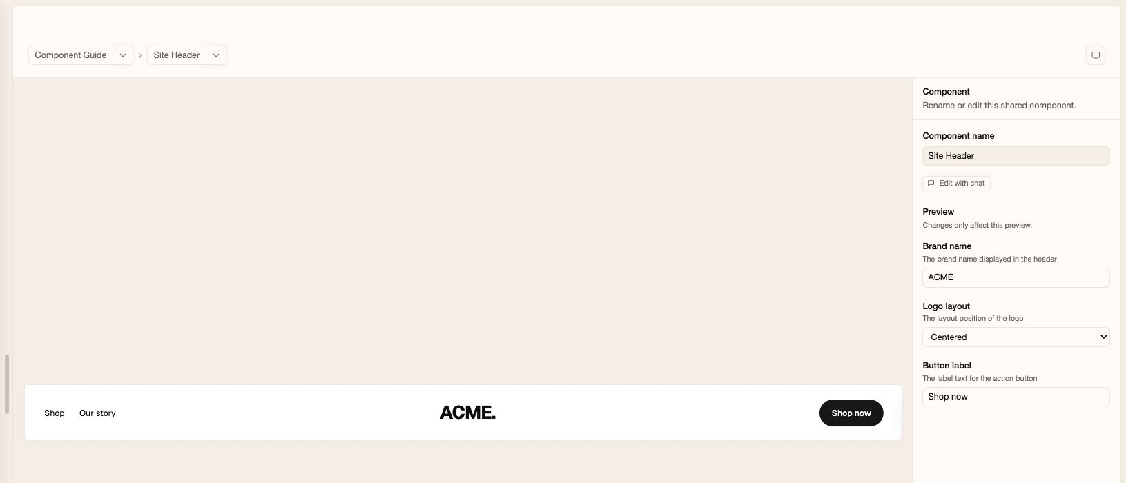 Want to refresh the header across your site? Click **Edit in chat** and send:
```text theme={null}
Center the logo in Site Header on every page that uses it. Keep the links unchanged.
```
You can keep building with the same header. When you ask for another page, include “Use Site Header for the navigation.”
## A footer that fits each page
Reuse your contact details and navigation, with a shorter version for focused landing pages:
```text theme={null}
Create a reusable component called Site Footer with my brand name, a short description, navigation links, and a contact email. Add a toggle for showing the description. Use it on my home page and landing page.
```
Open **Site Footer** in the Component Library. Try hiding the description in the preview to see the compact version.
Want to refresh the header across your site? Click **Edit in chat** and send:
```text theme={null}
Center the logo in Site Header on every page that uses it. Keep the links unchanged.
```
You can keep building with the same header. When you ask for another page, include “Use Site Header for the navigation.”
## A footer that fits each page
Reuse your contact details and navigation, with a shorter version for focused landing pages:
```text theme={null}
Create a reusable component called Site Footer with my brand name, a short description, navigation links, and a contact email. Add a toggle for showing the description. Use it on my home page and landing page.
```
Open **Site Footer** in the Component Library. Try hiding the description in the preview to see the compact version.
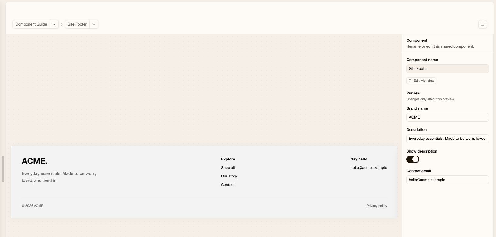 Then ask Replo to use that version on one page:
```text theme={null}
Hide Site Footer's description on my landing page only. Keep it visible on my home page.
```
Both pages still share the footer design. Later, you can update its contact email or navigation once for both pages.
## One buy box, different products
Build a purchase section you can reuse for new products and campaigns. First, connect Shopify or add your products in [Products](/apps/products), then ask:
```text theme={null}
Create a reusable component called Product Buy Box with a product picker, product image, title, price, variant selection, quantity, and an Add to cart button. Add stacked and side-by-side layouts and a toggle for showing the description.
```
Choose **Product Buy Box** in the Component Library. In the preview, pick a product and try the layouts. Switch products to see how the design looks with different images, titles, and prices.
Then ask Replo to use that version on one page:
```text theme={null}
Hide Site Footer's description on my landing page only. Keep it visible on my home page.
```
Both pages still share the footer design. Later, you can update its contact email or navigation once for both pages.
## One buy box, different products
Build a purchase section you can reuse for new products and campaigns. First, connect Shopify or add your products in [Products](/apps/products), then ask:
```text theme={null}
Create a reusable component called Product Buy Box with a product picker, product image, title, price, variant selection, quantity, and an Add to cart button. Add stacked and side-by-side layouts and a toggle for showing the description.
```
Choose **Product Buy Box** in the Component Library. In the preview, pick a product and try the layouts. Switch products to see how the design looks with different images, titles, and prices.
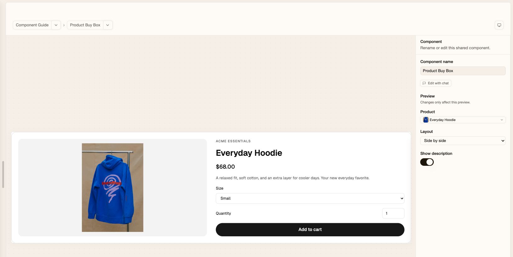 To add it to your pages, name the products and pages in chat:
```text theme={null}
Add Product Buy Box to my landing page using [product name] with the side-by-side layout. Use it on my home page with [another product name] and the stacked layout.
```
Replace the bracketed names, or mention your products with **@**. Each page gets its own product and layout. When you improve the shared design, both pages get the update.
Open each page to check product options and Add to cart before [publishing](/publishing).
## Buttons that stay consistent
Small details can be reusable too. Create a button with the styles you need:
```text theme={null}
Create a reusable component called Call To Action with an editable label and link, primary and secondary styles, and small and large sizes. Match my site's button design. Use it for “Shop now” on my home page and “Explore products” on my landing page, linking both to my product listing.
```
Choose **Call To Action** in the Component Library and preview its styles and sizes.
To add it to your pages, name the products and pages in chat:
```text theme={null}
Add Product Buy Box to my landing page using [product name] with the side-by-side layout. Use it on my home page with [another product name] and the stacked layout.
```
Replace the bracketed names, or mention your products with **@**. Each page gets its own product and layout. When you improve the shared design, both pages get the update.
Open each page to check product options and Add to cart before [publishing](/publishing).
## Buttons that stay consistent
Small details can be reusable too. Create a button with the styles you need:
```text theme={null}
Create a reusable component called Call To Action with an editable label and link, primary and secondary styles, and small and large sizes. Match my site's button design. Use it for “Shop now” on my home page and “Explore products” on my landing page, linking both to my product listing.
```
Choose **Call To Action** in the Component Library and preview its styles and sizes.
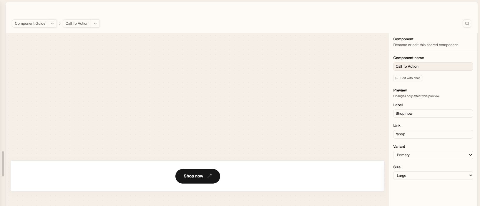 To change the shape of every button using this component:
```text theme={null}
Make Call To Action's corners fully rounded everywhere it is used. Keep each button's label and link.
```
## Common questions
Yes. Name the page and describe the part you want to reuse: “Save the
reviews section on my home page as a reusable component and add it to my
landing page.” You can reuse a whole section or something as small as a
button.
Yes. Name the page and the change: “Use a secondary Call To Action button on
my landing page only.” You can vary content, products, and options while
keeping the shared design. If you want a completely separate design, ask
Replo to create a new component for that page.
Ask for them in chat. For example: “Add an announcement bar to Site Header
with editable text and an option to hide it.” Then open the component in the
Component Library to preview the new options.
Some properties can't be edited manually. Ask Replo in chat to adjust those
properties for you.
Components are shared within one site. Your saved edits stay in draft until you [publish](/publishing).
To change the shape of every button using this component:
```text theme={null}
Make Call To Action's corners fully rounded everywhere it is used. Keep each button's label and link.
```
## Common questions
Yes. Name the page and describe the part you want to reuse: “Save the
reviews section on my home page as a reusable component and add it to my
landing page.” You can reuse a whole section or something as small as a
button.
Yes. Name the page and the change: “Use a secondary Call To Action button on
my landing page only.” You can vary content, products, and options while
keeping the shared design. If you want a completely separate design, ask
Replo to create a new component for that page.
Ask for them in chat. For example: “Add an announcement bar to Site Header
with editable text and an option to hide it.” Then open the component in the
Component Library to preview the new options.
Some properties can't be edited manually. Ask Replo in chat to adjust those
properties for you.
Components are shared within one site. Your saved edits stay in draft until you [publish](/publishing).